Data Explorer
A tool for science communication and citizen science

The Data Explorer is an online tool for science communication and citizen science developed during my research at LUT University. The idea behind the data explorer is to provide a platform to connect diverse data from across fields.
The Data Explorer was designed and developed for the Parcos research project and was funded by the EU Commission under Horizon 2020. The first prototype of the Data Explorer was made in Unity, if you’d like to learn about my research goals for this project you can read my publications “User Experience for Non-Expert Audiences in Data Exploration” and “Principles for Designing for Data Exploration for a Non-Expert Audience”.
You can try out the online prototype of the Data Explorer by clicking here!
Project Overview
Problem
My Role
UX Designer, UX Researcher
Timeline
Oct 2020 - Feb 2023
Project Info
Prototype for EU funded research project
Tools
Unity, Figma, Miro, Photoshop, Tobii Eye-tracker, Nivivo
Data accessibility and inclusivity is especially important when researchers are outsiders working with local communities, as it is necessary for building trusts between scientists and the general public. Local people can have unique knowledge that scientists may not have considered or have access to, and people may want to give their perspective on research and data that affects them directly. For example a researcher investigating the effects of climate change in an community may need an accessible way to both present their data to the community and to collect data directly from community members.
Solution
My solution to this problem was to build the Data Explorer, a tool which serves as a way for researchers to include non-experts in the research process. The Data Explorer is a novel way of visualizing a diverse range of data sets in the same space, and is tool that allows the average person to be able to interact with data and curate data by creating their own "data stories" from data sets chosen by scientific experts.
Design Process

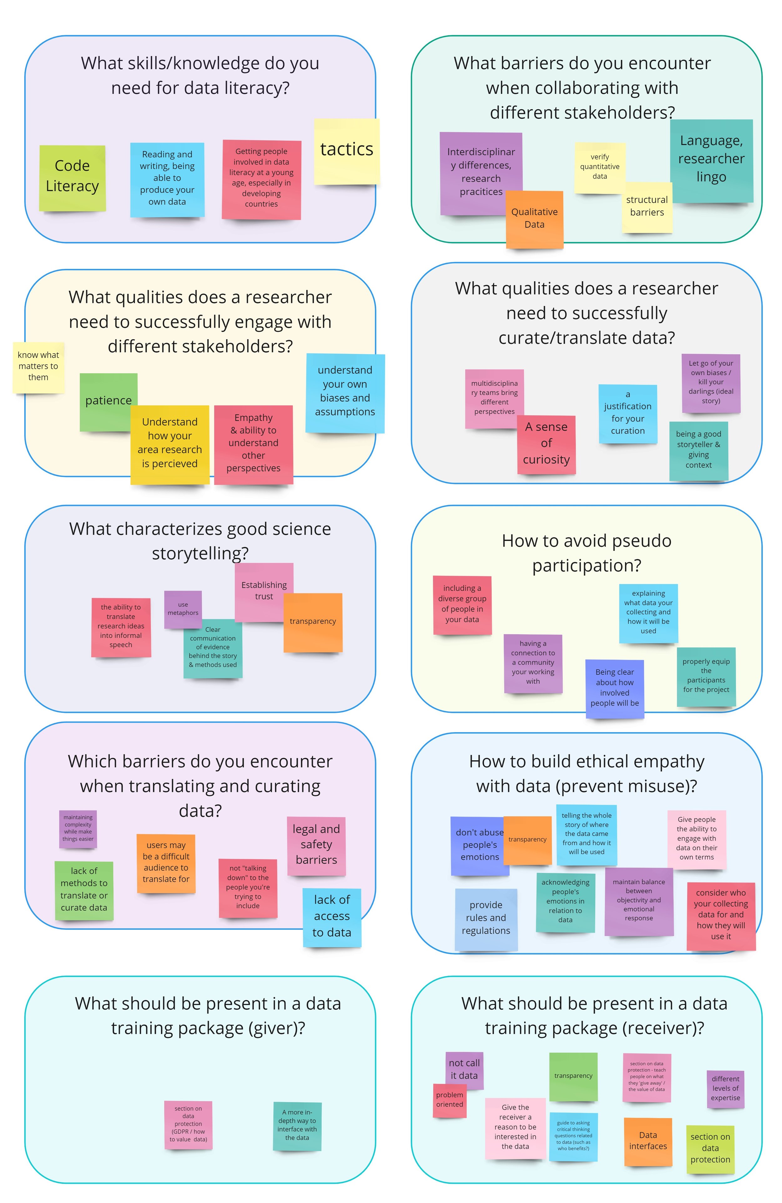
Miro board from interview session
Research Stage
User Interview Session
Our goal with the Data Explorer was to build a data visualization system that both researchers and the general public could use, therefore I conducted a group interview with a small focus group of researchers and science communicators about what their needs are when it comes to communicating scientific data to the general public. The group interview consisted of a 20 minute brainstorming session using the white boarding tool Miro, where I asked the group to answer several questions related to data dissemination.
Literature Review
I then conducted a systematic mapping review of similar interactive data visualization systems aimed at a general audience. 548 papers were selected for the initial review which was narrowed down to 24 papers in the final review. The design choices in these 24 papers were distilled into a set of principles that informed the design choices made for the Data Explorer.
The complete literature review is summarized in our publication: Principles for Designing for Data Exploration for a Non-Expert Audience

Steps of the systematic mapping review
Principle 1: Allow users to find their own patterns in the data.
Principle 2: Visualize relationships between data sets.
Principle 3: Use artistic expression to engage non-expert users.
Design Stage
User Flow
Based the interview session and the literature review I then made a user flow of actions a user could take within the Data Explorer. This flow chart was referenced during the wireframing process.
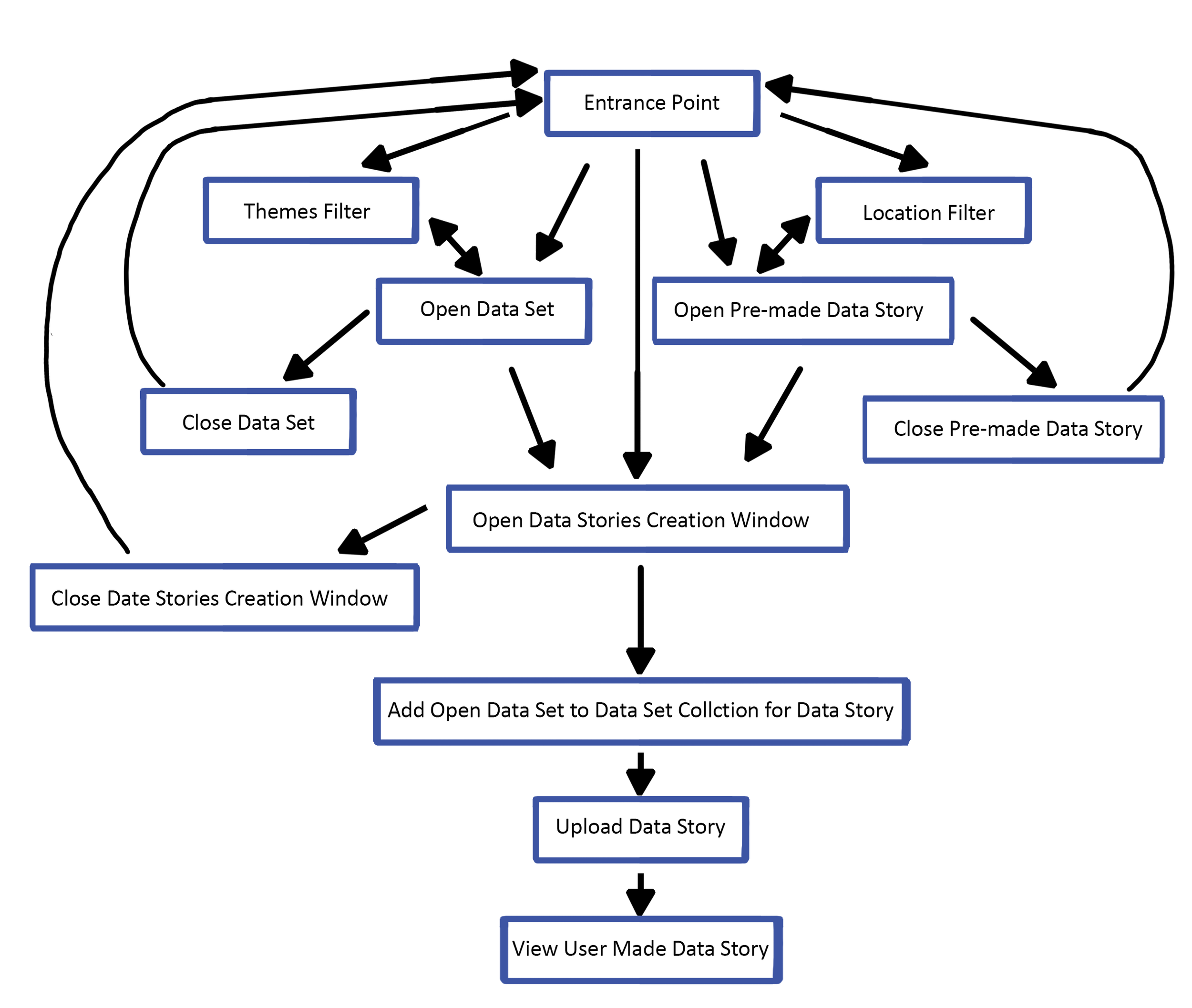
User flow of the Data Explorer
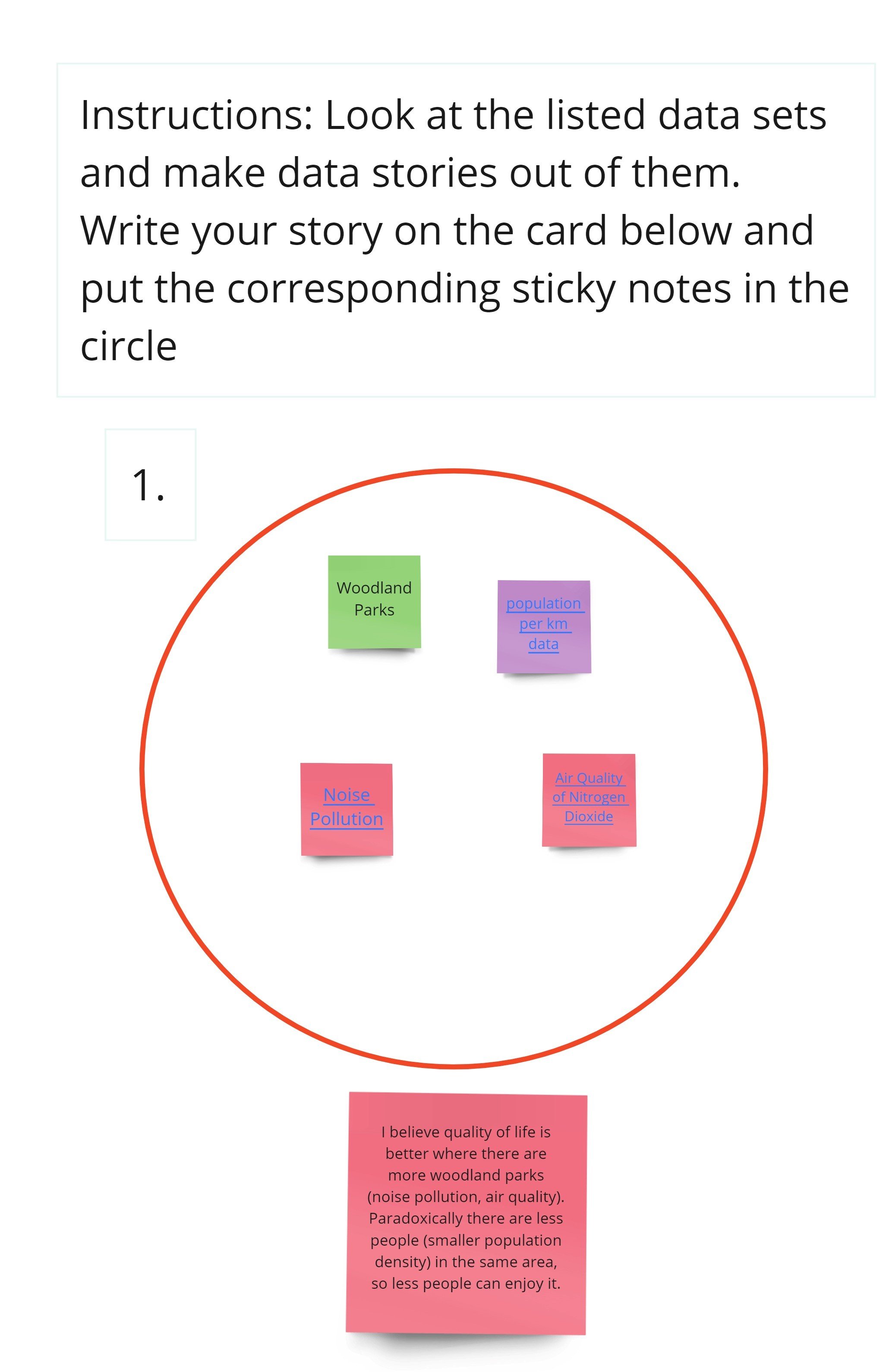
A user’s data story from the user testing session
User Testing of Lo-fi Prototype
In order to be sure that the conceptual model of the tool is understandable for users, user testing was conducted using a lo-fi prototype that was made up Miro. 5 members of the general public were selected as testers
For this user testing session, users were asked to investigate labeled sticky notes that contained links to corresponding open source data bases that users could explore. The sticky-notes were colored depending on the type of data they related to, light green was “green spaces” dark green was “squirrel habitats”, dark blue was “bat areas”, purple was “population data” and red was “pollution data”.
After they investigated the open source data bases, the users were then asked to create a story describing what relationship they believe the data sets could have to each other, if any. The users were then asked to put the sticky-notes they used in their stories into their “data story collection circle”.
Mockups, Wireframe & Clickable Prototype
The user testing session showed that users had a hard time understanding the conceptual model of the Data Explorer. In order to help with this I made high fidelity mockups which were then used in the wireframe and the clickable Figma prototype.
The wireframe was then presented to 3 HCI researchers who gave feedback on it, and after some revisions based on feedback the the clickable prototype was made.
Next the clickable prototype was presented to the group of researchers who participated in the initial interview session. Observation based user testing was done as I took note of what the largest pain points of the clickable prototype were.

Data Explorer wireframe with high fidelity mockups
Data Explorer V1
The user testing session with the clickable prototype lead to some changes being made. For instance “Timeline Mode” was removed as it was found to be a confusing feature and ending up not being used at all by any of the participants. Also data sets which are shared between stories are no longer shown as stars in the middle of the visualization, but rather just as lines linking the same data sets in different stories together.
Once the design changes were decided upon I began working on Data Explorer V1, a prototype of the Data Explorer meant to be released to the public. I coded this more complete version of the Explorer in Unity using C# and published it online with WebGL, and the art assets I made in Photoshop.

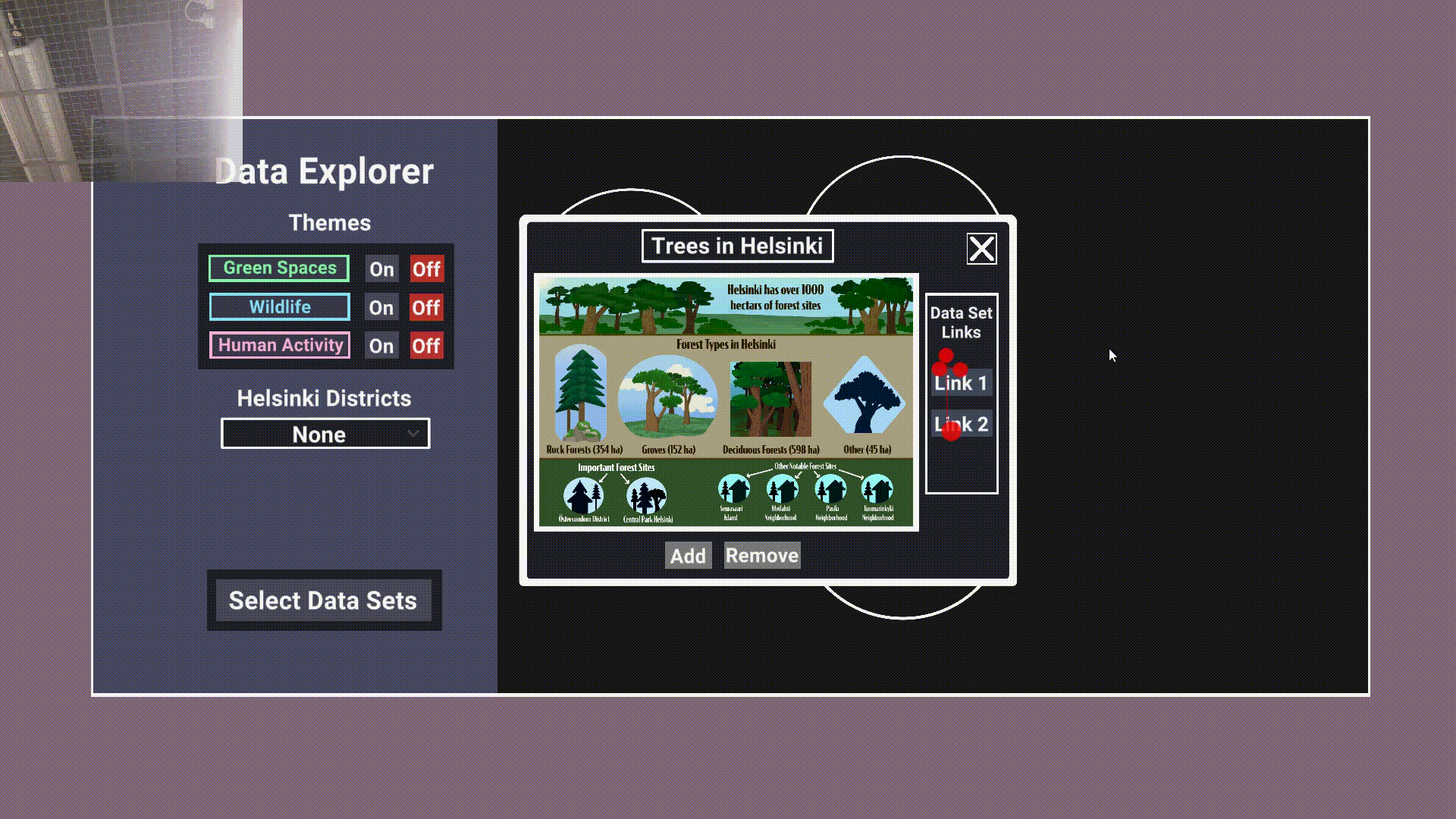
One of the data sets being opened

A theme button & location drop down menu being selected
Evaluation Stage
Usability Testing
A user interacting with the Data Explorer, the red dots and lines represent the user’s gaze, the circles represent where they clicked.
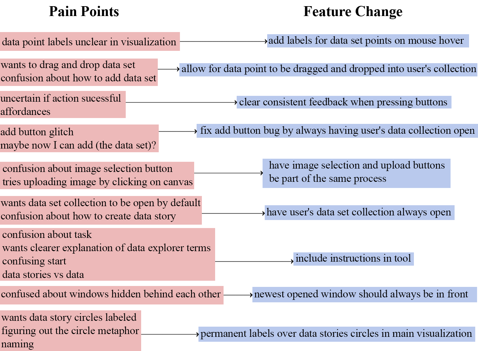
Pain points and corresponding feature changes.
For evaluating The Data Explorer V1 a usability test was conducted with 15 potential users, with the users signing a consent form for the collection of their data. During the study, users were asked to perform a series of tasks in the Data Explorer, such as “find and open the trees in Helsinki data set window”. The users were asked to talk aloud about the tasks as they did them, openly expressing their thought and ideas in a free flowing manner. This was captured via screen capture footage and audio recordings. Eye tracking data, mouse tracking data and screen recording data was also collected, which enabled us to observe what elements of the screen users were most engaged with and to see what pain points users may have encountered but not articulated clearly in their audio recording. The audio was then made into transcripts, and a group of 3 researchers, myself included, analyzed all of the data via a thematic synthesis wherein we looked for common usability problems that users faced.
The results of this usability study are summarized in our publication: User Experience for Non-Expert Audiences in Data Exploration
Future Evaluation & Iterations
The current version of the Data Explorer will be tested by a much wider audience and there will be future releases of the Data Explorer as I progress in my research. My goal with this project is to be able to conduct an “in the wild” study with a future version of it in a setting such as a classroom or community center.