The Oodi

A library built for people

Today I want to talk about my favorite building in Finland, the Oodi. The Oodi is a library, now I love all libraries but the Oodi might be my favorite in the world because of how wonderful its accessibility and usability is. Opened in 2018, the Oodi library is one of my favorite examples of user-centric design and co-design.

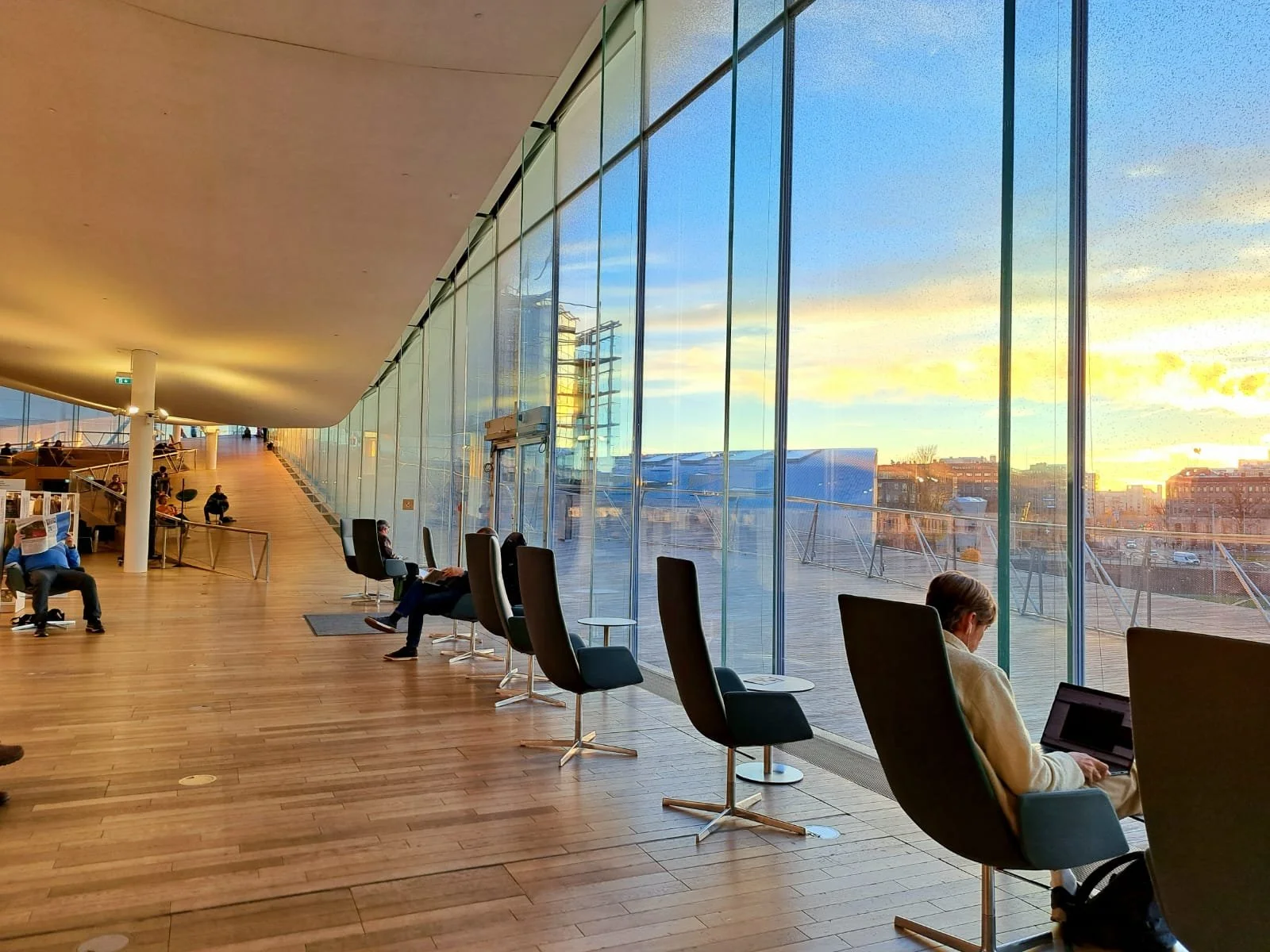
A photo I took of sunset on the top floor of the Oodi

User-centric design has become something of a buzz word of late, but truly well executed user-centric design is not as common as it should be. User-centric design focuses on simplifying tasks for users and focusing on visibility and usability and accessibility of elements a user would interact with. So what does user-centric design mean for a library? Well it means the obvious stuff like having wheelchair accessibility, but it also means accounting for how the users will prefer to use the space, i.e. will they bring laptops and therefore need outlets? Will they need spaces to work on group projects? Will they need dedicated children’s spaces? The Oodi has all this and more.

On the first floor of the building you have book checkout and returns, a public computer lab, a youth hangout space, a small restaurant, an art exhibit and a few chess tables. On the second floor of the building you have group study rooms, music studios, a makerspace with various tools such as 3D printers and sewing machines, a kitchen, gaming rooms and frankly more that I’m probably forgetting. And finally on the top floor you have the majority of the book shelves, open tables with outlets for studying, a children’s playground and storytime room, a cafe, an event space, and, when the weather is nice, an observation deck.

In essence the Oodi is a fully functioning town square that contains everything you might want for a day full of activities. In that sense it reminds me of what Victor Gruen, the creator of the shopping mall, intended malls to be, which is indoor all purpose town squares. Only instead of being centered around shopping, the Oodi is centered around community activities.

There is a reason that the Oodi is so community centric, (beyond it being a library or course) and that is because the Oodi is utilizing the other design method that I brought up, co-design. Co-design is a Scandi/Nordic design method so it’s no surprise that the Oodi utilizes it. Co-design at the most fundamental level, simply means involving users in the design process in a way that treats them as equally knowledgeable,  it’s a method that seeks to treat users as literal "co-designers" and views users as experts in their own wants and needs. When the library was first proposed, co-design ideation workshops were conducted with residents of Helsinki, and the co-design process has not ended there, throughout the years the library has continued to incorporate feedback from its visitors

This is why I find the Oodi library so compelling, it is a project that focuses on its users first and foremost, and treats its users as experts in their own needs, which has led to a space that fosters community and connection.

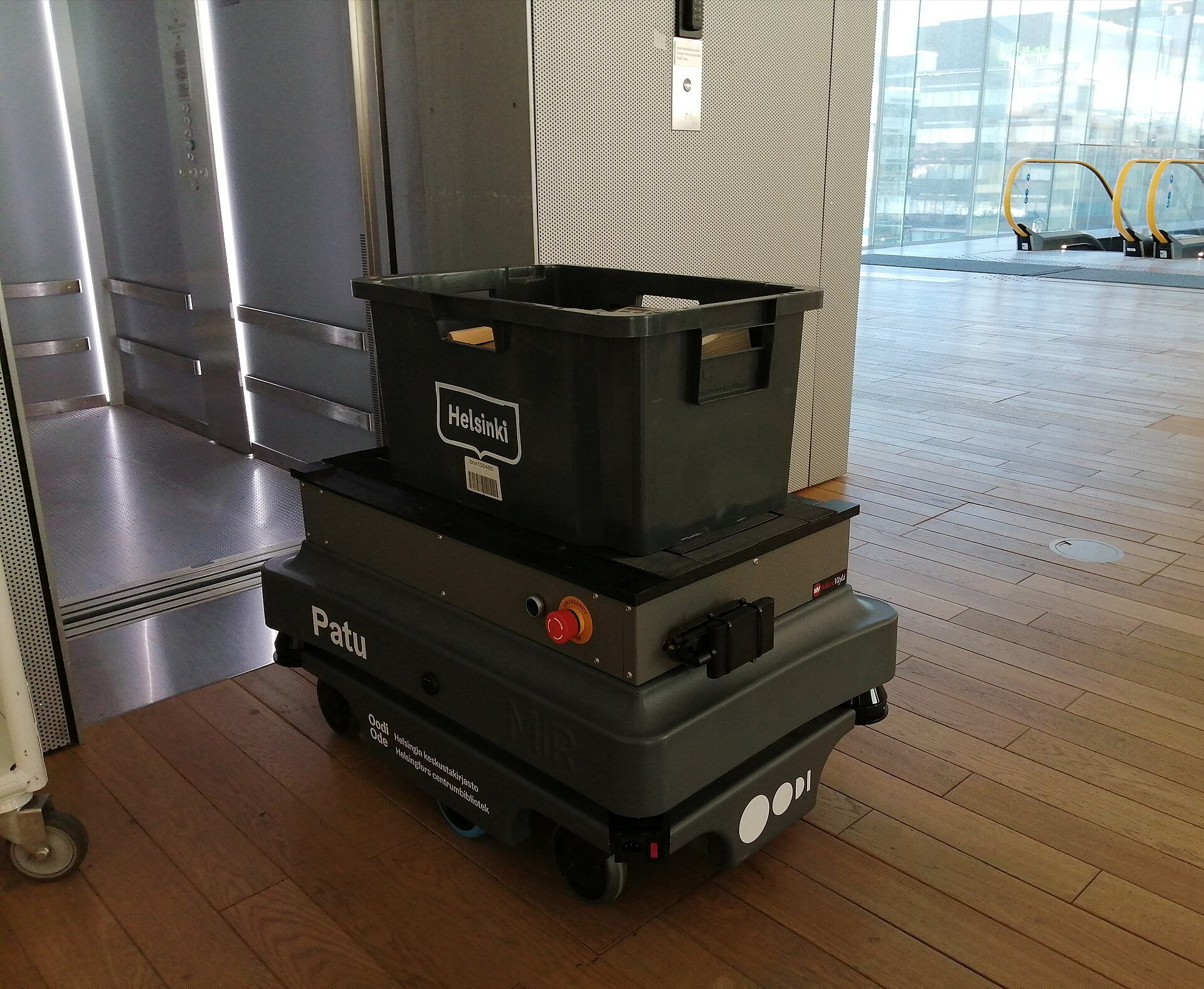
And if that doesn’t convince you to visit, perhaps the cute little book carrying robots will.

A book carrying robot at the Oodi.

The Optimization of UX

While I’m writing this we are halfway through 2026, and UX has undergone a transformation, a transformation towards optimizing for a smooth seamless user experience at the expense of creativity.

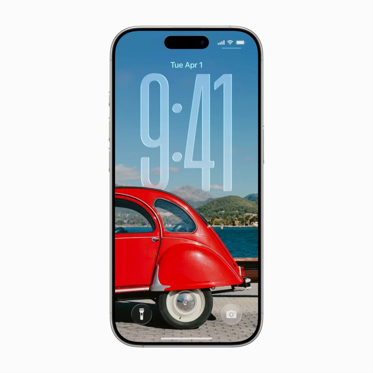
The iphone might be one of the biggest symbols of sleek optimized UX in pop culture.

Gone are the days where a plucky designer can get a foot in the door at a cool interesting company with just a unique portfolio, to get to work on the truly innovative projects these days you need technical skills, be that data management skills, quantitative research skills, full stack development skills or all three. On some level I understand the push towards technical skills, in UX, it’s part of the broader trend towards data driven design and optimization, data driven design is great for creating frictionless, intuitive experiences that allow for fast action and decision making. Take designing an air traffic visualization tool for air traffic controllers, in that scenario you would absolutely want the UX of that system to be as smooth and intuitive as possible, however, I do think that in the strive for optimization, something is lost, namely creativity and innovation. I’ve talked before about the dichotomy of design and art and in my opinion all man made objects fall somewhere on a spectrum between design and art, take the example of a chair, a chair can be as functional as possible, prioritizing use above all else, a chair can also be a work of art, made as an artistic expression as much as it is an object to sit in. Optimization, which data driven design amplifies, pushes for systems to emphasize design, and in particular design that focuses on frictionless UX, first and foremost. 

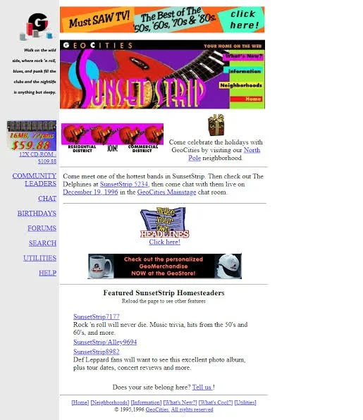
The famous Sunset Stripe neighborhood in Geocities.

Data driven design and optimization does have its place, however I feel that something is lost in the overemphasis on frictionless design. In aiming for frictionless design, we can end up sanding down the parts of an interactive system that are interesting, unique, or that challenge us to think in new ways. And to go back to my comment about plucky designers, in aiming for highly optimized frictionless design the industry filters out designers who are new, inexperienced or just out-of-the-box, essentially excluding new voices and perspectives from the world of UX. To use statistical terms, the arms race of optimization has normalized the types of interactive systems that get made, making interactive systems (websites, apps, mainstream games, etc.) start to feel the same. The message that designers are taught is that unusual, experimental, and innovative interactive systems that may have a high learning curve are not what the industry wants, so designers start self selecting for frictionless optimized design at the expense of innovation, shifting their projects and portfolios towards what everyone else is doing. And something really has been lost in the push for optimization, think of how creative websites used to be in the 90s and early 2000s, while they did not necessarily have smooth easy to pick up UX, no can deny that early websites had creativity.

This also ties into the proliferation of AI in design, gen AI designs, are bland at best, (and unusable at worst), if you’ve ever played around with gen AI in design tools you’ll notice that they always seem to produce the same cookie cutter UI systems that follow the same cookie cutter UX. Ironically gen AI driven UX systems are never data driven, because there is no user research involved in a cookie cutter gen AI UX system that has been slapped on an app or webpage, but on the surface level they have the appearance of being optimized, because the UX systems they are trained on have been optimized, and this is enough for some stakeholders who only have a surface level understanding of what design is.

Overall I think that there should be a balance between optimization and experimentation, while optimization serves an important purpose, leaning too hard into prioritizing optimization comes at the expense of experimentation and creativity in UX.

Everything I write was written using only my brain, if you are interested in my research, please visit my website’s about page.

If you are interested in collaborating with me in some way, please reach out to me on Linkedin.

The Brilliant Interaction Design of Katamari Damacy

Today I want to discuss a video game, one you’ve probably heard of if you’re into video games, Katamari Damacy. As always my posts have almost nothing to do with current trending topics and instead have to do with whatever random design related thought floats to the top of my brain. And right now that thought is “Katamari has some of the most unique interaction design I’ve experienced”.

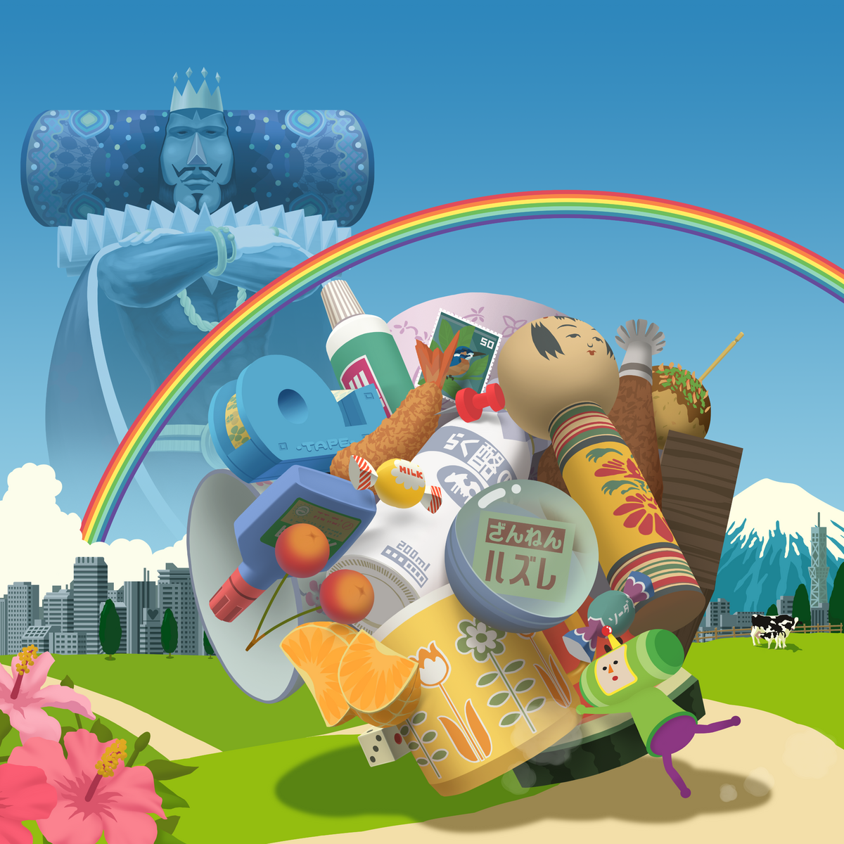
Key art for the second game in the Katamari series, which in my opinion is just as good as the first game.

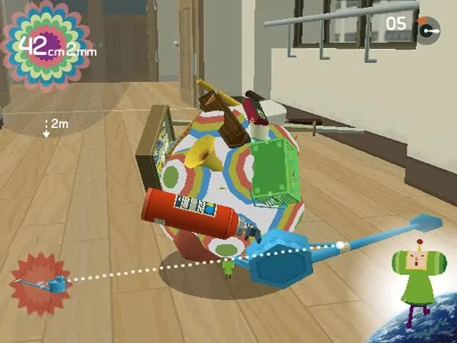
Katamari Damacy, released in 2004, is a game where you roll a ball around, collecting objects as you roll and making your ball, your “katamari” bigger. And when I say bigger I mean bigger, (spoilers for a 22 year old game) you start out with a tiny katamari, rolling up tiny things like paperclips, tiny bugs, and strawberries, eventually moving up to objects as big as houses, cities, and even islands, and finally in the credit sequence of the first game, rolling up all the countries of the world. The simple premise of “roll thing get bigger” leads to a very intuitive feeling progression system, making your katamari bigger is incredibly satisfying and as you grow your katamari and are able to roll up objects that were previously barriers, new areas of a level will unlock.

This is the core gameplay loop, roll something up, get bigger, find new things to roll up, repeat until a level is complete. Sometimes getting as big as possible within a time limit is your goal, and sometimes reaching a certain size as quickly as possible is your goal. And sometimes there are other specific goals, like rolling up as many crabs as you can, and there are hidden unlockable characters and items that you can roll up. The gameplay loop is straight forward and allows the interaction design, i.e. the mechanics of the game to really shine, while also being a very unique gameplay loop, not found in many games that predate Katamari.

A screenshot from Katamari Damacy

When encountering interaction design experiences, be they video games, websites, apps, devices, interactive exhibits or something else entirely, I am always hoping to find interaction methods that are truly unique, and Katamari was truly unique when it was released. Your character, The Prince of all Cosmos, (in addition to having unique controls Katamari also has a very quirky and unique setting), is mostly controlled by moving both joysticks on your controller at the same time to roll your Katamari ball around. It was a control system unlike any other for its time and it really does simulate the feeling of rolling a giant ball around in front of you. While the controls are simple to understand, the learning curve of mastering them can be quite steep, this I think is an indicator of how good a game it is. The creativity of the core gameplay loop, and simplicity of the controls, combined with depth of difficulty the tougher levels can present, is what makes this game so good. There is no bloat in Katamari, no unnecessary leveling systems, or tacked on half-baked mechanics that take attention away from the core mechanic of rolling your Katamari and making it bigger. The simplicity of the mechanics is what makes the game so good, it’s a game that knows how it wants its players to interact with the world, and it does that well.

The simple mechanics also contrast with the over the top art style. Katamari, as you might have noticed from the images I’ve included, is a crazy colorful, visually overwhelming sensory experience. The aesthetic is campy and bright and silly and weird in such a fun way, but if there were say, a bunch of menus also on the screen, I think that aesthetic could easily feel overwhelming to players. The simple interaction design allows for a wacky fun art style, and prevents the game from feeling like too much. The simple interaction design also really gives a spotlight to the music, the music in this game is great, with lyrical songs from genres such as funk, j-pop, and jazz, it feels great to be rolling along while singing “I wanna roll you up into my life”, and if it wasn’t for the simple mechanics, the boisterous lyrical music would probably feel overwhelming.

Katamari Damacy, in addition to being a great game from an interaction design perspective, is also in my opinion a great work of art. The game was intended by its creator as a commentary on consumer culture, the act of endlessly rolling up objects mimics our own overconsumption, and throughout the game as you roll up a myriad of man made objects such as paperclips, sandals, old magazines, sponges, plastic toys, and gum packets, you can’t help but contemplate just how much human made detritus there is in the world. Each item type you roll up is put into a collection log that can be accessed from the overworld and viewing that log shows emphasizes how much man made objects there are in the game (and in real life) compared to natural objects like plants and fish and fruit.

The game is also darkly satirical against its bright and wacky backdrop, (plot spoilers ahead for a 20+ year old game), the main plot of Katamari is that the King of all Cosmos got drunk and accidentally destroyed all stars in the cosmos except for Earth. He then asks (or rather orders) his son, your character, the Prince, to roll up objects on Earth so that he can remake the stars. The King’s wanton disregard for the cosmos can be compared to our own disregard for our planet, and the all consuming Katamari that proceeds to roll across the planet that threatens the Earth as an equally horrifying and hilarious Kaiju, can easily be read as a metaphor for our own horrifying yet hilarious overconsumption destroying the planet, as we slowly consume the planet with our plastic water bottles, old t-shirts, and discarded TVs. The irony of a Katamari that is in large made up of our own detritus rolling across the landscape, and ultimately consuming us humans, is both darkly funny and an apt metaphor of our current climate crisis.

This whole metaphor of overconsumption is built upon the interaction design, upon the mechanic of rolling up objects, getting bigger and rolling up more objects, and this is perhaps the biggest reason that I love Katamari Damacy, the interaction design works in tandem with the artistic message, and that artistic message is directly tied to the mechanics and made more impactful by them. If Katamari was not a game about rolling up objects and consuming the world, the anti-consumption messaging would not work as well as it does, nor would the dark satirical angle. This is in my mind, the best type of interaction design as art, when the interaction a user does supports the message of the art. And indeed if games deserve to be called art (which I believe they do), then Katamari must surely be ranked among the one of the best games ever made from an artistic perspective, not only a design perspective.

If you are interested in my research, please visit my website’s about page.

If you are interested in collaborating with me in some way, please reach out to me on Linkedin.

Gen AI and Strip-mining the Internet for Content

The mirror colonization of the internet

As someone who grew up in internet spaces, who first got onto the internet as a child during the Myspace era, I’ve watched the slow transition of the internet from an open wilderness, full of small communities with their own rules, to an enclosed space with virtual walls and fences, where the rules are made, not by the community, but by the website (or app) owners, by internet barons if you will.

When I was eleven I remember having a class discussion about the internet and how the (then growing) Facebook was changing the landscape of it. “It won’t always be the wild west online”, was what our teacher said, at the time I didn’t believe him. It was inconceivable to me that the internet could be boxed in, I was a nerdy kid who spent a lot of time online, and it seemed boundless back then. Of course things have changed now, now only have internet spaces been enclosed, there is an active attempt to push out human voices on the internet via AI slop.

Today I want to explore the evolution of the internet as a cultural space through the lens of colonization, because frankly, I don’t think it’s an inaccurate framing. This is in no way intended to lessen the impact of real-world Colonialism, and of course, unlike in real-world Colonization, no one has died in the process of internet colonization. But subcultures have died, communities have died, and spaces that were once communal have been privatized, controlled and exploited, and in that sense the changes that have happened to the internet can be said to be a mirror of real-world Colonization. So to distinguish this phenomena from real-world capital-C Colonization, which has had an almost incomprehensible impact on history and still affects people deeply today, I’m going to refer to this phenomena as mirror-colonization, because it reflects capital-C Colonization, and I believe, is a derived from a similar mindset of resource extraction, and devaluing humans, that drove real-world Colonization.

Mirror-colonization, as I see it, pertains to ephemeral, non-physical communities rather than communities that inhabit or have inhabited, real-world places, it involves the commodification, privatization and exploitation of that non-physical community for profit, often at the expense of the community that built or supports it. The internet is not a place physically, but is still a place we go to, with different regions, such as different websites, apps, forums etc. And each of these online places have their own community and own culture, or multiple communities and cultures. 

On the internet, mirror-colonization started with the privatization of the internet, which to an extent, began even before I was born, but which really ramped up in the early 2010s. After moving away from more open forms of internet space curation, such as webrings, internet spaces became curated via search engines SEO (search engine optimization), which ultimately lead to paid SEO, allowing companies who had the most money to push their websites to the front page of search engines like Google. This led only to the prioritization of websites owned by for profit companies, but led to advertisements becoming some of the first results you would see in a Google search. But that point, the internet had already begun to silo and congeal into large corporate owned websites that required creating user accounts to view information, Facebook and Twitter were two major

But internet places are not the only ephemeral communities where mirror-colonization can happen. A similar type of mirror-colonization can be said to have taken place in the punk community in the 80s. What started as an organic subculture, intended to rebel against corporate greed, commercialization, and capitalism (among other things) eventually became co-opted by those very same forces. Corporate companies now sell the idea of punk (along every other subculture under the sun), offering your strategically pre-ripped jeans for only $9.99, made by an impoverished woman in Bangladesh, so that you can look punk, while completely disregarding the ethos and ideas of punk. This mirror-colonization is a process which has happened to countless subcultures, punk, hippie, emo, reggae, hip-hop, and countless more. Mirror-colonization is probably happening to some subculture I’m unaware of right now. I want to explore the topic of subcultures, mirror-colonization and commercialization more thoroughly in a future post, but for now, let’s just acknowledge that this problem is widespread and pervasive in 2026..

I bring up punk in the context of mirror-colonization, because I think it’s important to acknowledge that this phenomena did not begin with the internet, nor will it end if we all stopped using the internet tomorrow, the sense of soullessness you may feel when perusing the internet these days is not rooted in the internet itself but is a systemic problem. This is a pervasive problem that’s rooted in the way modern society has built up capitalism, to be a system that extracts resources, for profit, as efficiently as possible, and then disregards the source (place, community etc.), those resources were extracted from.

Extraction of resources at all costs, is where colonization, both capital C-Colonization and mirror colonization ultimately lead. And this brings us to generative AI, specifically generative AI in the context of creative work and community made work. At this point you’ve probably heard about how generative AI pulls from large databases of unlicensed works, and how the creators of those works have no way to opt out, or even know that their work is being stolen. I am by no means wholly anti gen AI, being an HCI researcher myself, I of course understand that it has its positive use cases, even including use cases for consumer-facing interactive systems. And perhaps in a future post, to counter the negativity of this one, I will go over what I feel are some examples of positive use cases of gen AI. But in the context of cultural artifacts such as visual art, creative writing, and music, and the communal online spaces that support these endeavors,  gen AI is almost wholly consumptive without contributing anything of substance.

Therefore, in the context of communal creative spaces, which make up much of the internet, gen AI is akin to a strip mining company or logging company tearing down a forest. A force that comes into a thriving space, takes all the resources that space has, and leaves nothing but trash and pollution in return, leaving the space lifeless and empty. Just look at Deviantart for an example of a place where this has happened, what was once a thriving community of artists and art fans, actively creating, interacting and engaging with each other, is now a wasteland of gen AI art, with a dying user base and little engagement. Now you could say that Deviantart has been on the decline for awhile now, and you’d be right, but the nail in the coffin was when Deviantart stole it’s user’s artwork to train its own gen AI model, and much like loggers destroying a forest, killed the very thing that gave it value.

Gen AI, as it stands currently, is largely used for the extraction and exploitation of resources, in this case personal data. Personal being the operative word there, the resources being extracted are personal, from photos of a child’s birthday party, to a poem written for a dead loved one, to a self-published book painstakingly written with blood sweat and tears. These are the artifacts that are taken without consent, processed as raw material, and then sold back to us, not unlike a mining company taking up land that does not legally belong to them and then selling what was extracted from that land back to its former inhabitants. This is, I believe, why gen AI, and especially gen AI in art and other cultural settings upsets people, it’s certainly why gen AI upsets me at times. On the one hand, as an HCI researcher I am excited to see how we can use LLMs and other gen AI systems in interesting ways, but as an artist I see the damage that gen AI cultural artifacts cause to online creative communities. And while I make no claims of being a historian, I can see the historical parallels between what’s happening with gen AI and what happened with other major technological revolutions, such as the industrial revolution which was supported by the transatlantic slave trade. Which is to say, in its current form, it’s a technology that is built off exploitation of labor, as has so often been the case.

If gen AI is to be a net positive for society as its major proponents claim it will inevitably be this is something that must be reckoned with.

Note: What I post on this blog is opinion, not scientific research, though I will sometimes link to relevant open-access scientific publications in my further reading section. If you are interested in my research, please visit my website’s about page.

If you are interested in collaborating with me in some way, please reach out to me on Linkedin.

Further Reading:

Post-Colonial Punk

Why DeviantArt Will Soon Be Dead And How The Platform Is Killing Itself

Andrejevic, Mark. (2009). Privacy, Exploitation and the Digital Enclosure. Amsterdam Law Forum. 1. 10.37974/ALF.86.

Oksanen, Atte & Celuch, Magdalena & Oksa, Reetta & Savolainen, Iina. (2024). Online communities come with real-world consequences for individuals and societies. Communications Psychology. 2. 10.1038/s44271-024-00112-6. 

Chateau Laurens, An Art Nouveau Dreamscape Villa in France

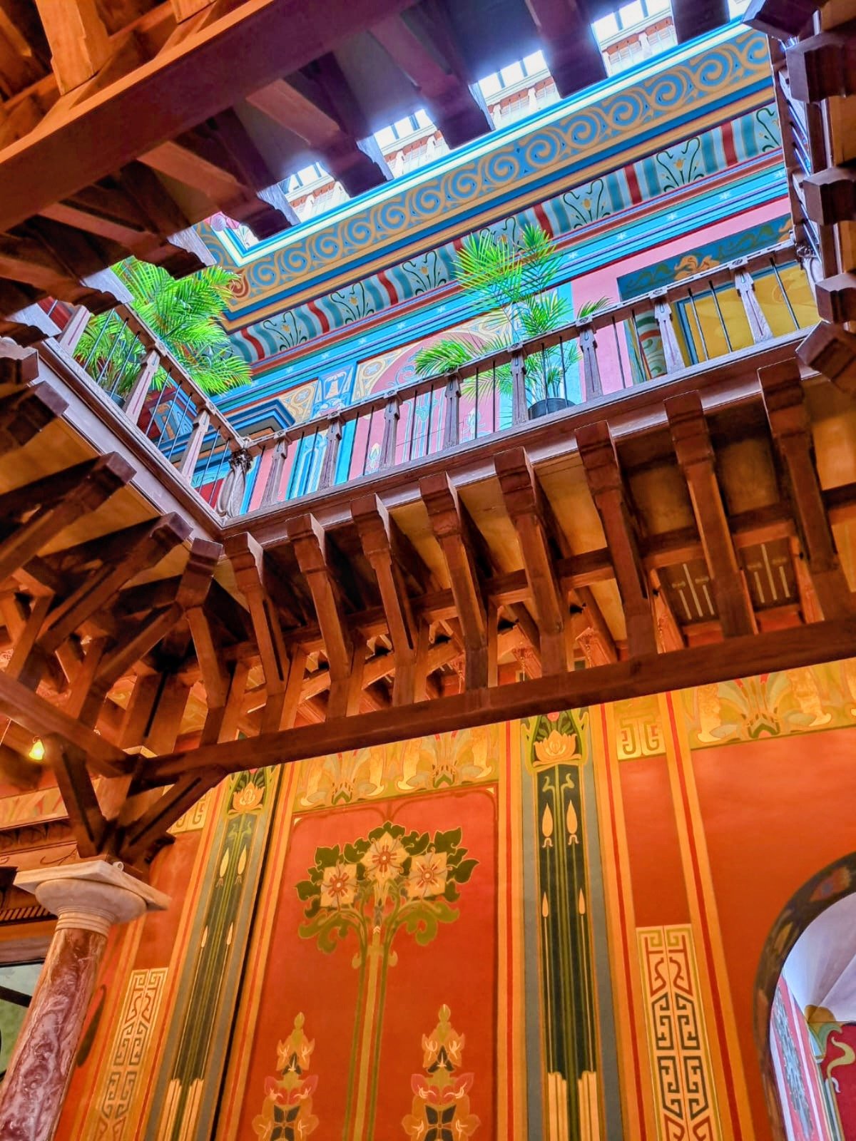
The second floor of the atrium at Chateau Laurens.

Recently I had the pleasure of visiting a truly unique architectural landmark, Chateau Laurens, and I wanted to discuss this building from a design perspective.

Historical Background

First let me provide some historical background, Chateau Laurens, completed in the year 1900, is a French villa built by the eccentric man, Emmanuel Laurens. Laurens was a medical student who suddenly inherited a fabulous amount of money in his 20s after a distant cousin died and left Laurens his entire fortune, around the same time Laurens’ father died, leaving him a large plot of land in the town of Agde, near Montpellier. This plot of land is where Chateau Laurens now stands. Laurens was known for being a bit of an eccentric, he was a great lover of art and travel and spent a good amount of his fortune traveling the world, brining back artworks and inspiration from the places he visited. After his travels he built himself a lavish villa, Chateau Laurens, which was meant to blend the aesthetics of the various places he traveled to. In 1994 the villa was bought by the city of Agde, with the intention of turning it into a historical landmark and tourist attraction, however it wasn’t until 2023 that the restoration of the villa was completed. And today you can visit Chateau Laurens with a guided tour in English or French.

The beautiful stain glass feature in the private quarters of Laurens and his wife. The bottom of the stain glass has a poem dedicated to the sea, the style of the stain glass draws inspiration from Japanese woodblock prints.

A House of Whimsy

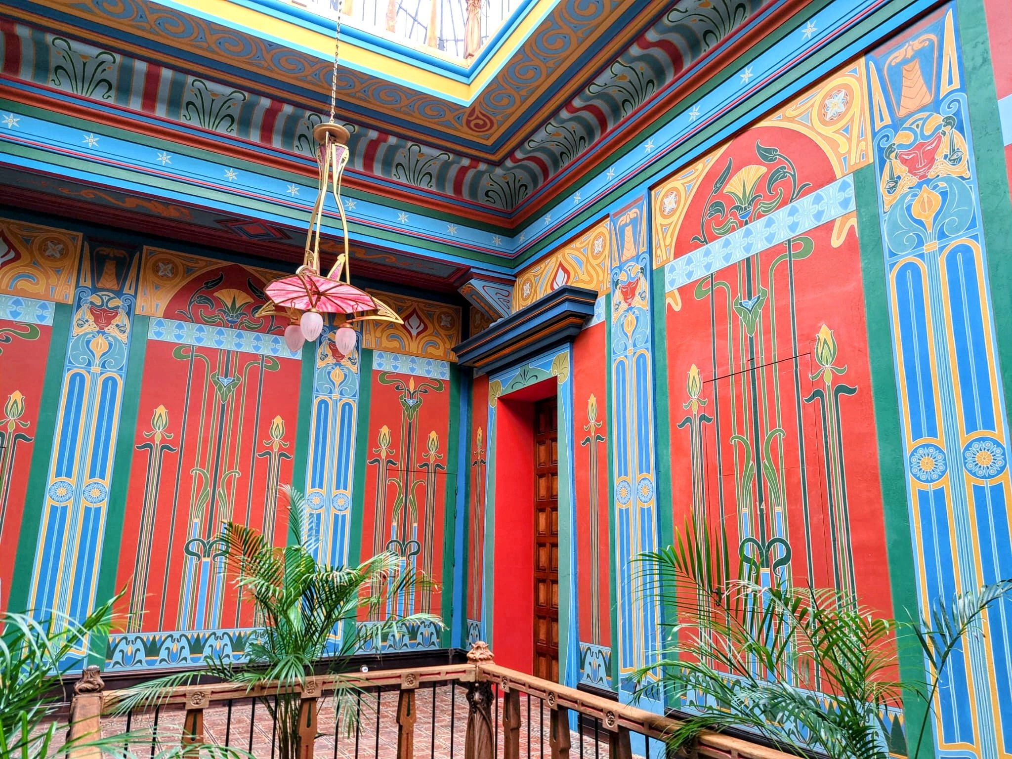
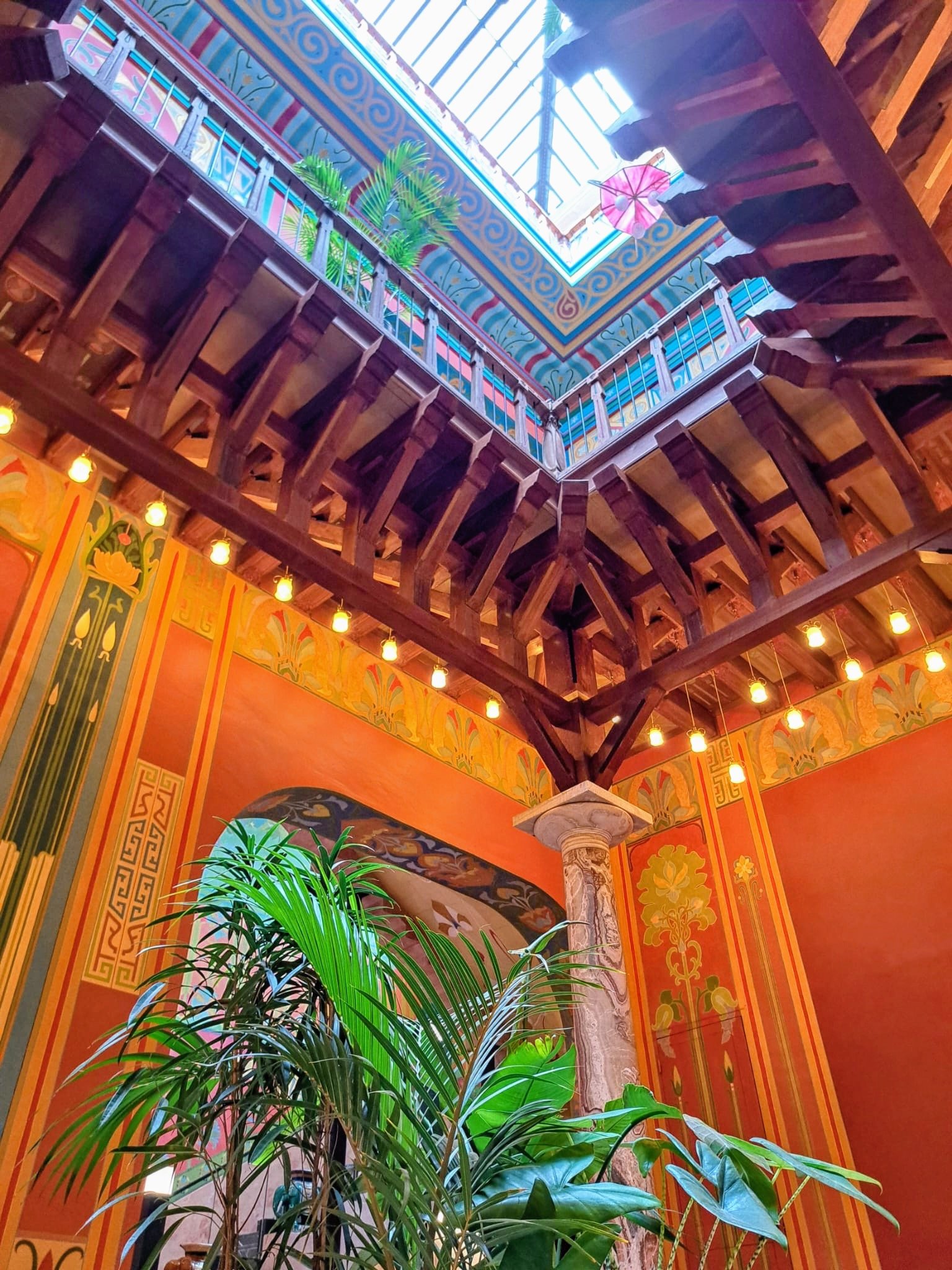
I was very determined to visit this villa, because aesthetically, it is totally my taste, I love art nouveau, and I love visual aesthetics that evoke fantasy, mythology and magic, which is something this villa does exceptionally well. Obviously aesthetics are partially subjective, but I I was floored by how seamlessly the villa blends aesthetic influences from different cultures. For example, the central atrium, which extends between the first and second floors via a central balcony is supposed to have Moorish influences, where as the staircase connecting the two floors is supposed to have ancient Egyptian influences. This central atrium also has a skylight, which provides ample light for the whole central part of the building, creating a pleasant and well lite space. To me, the villa looks like something out of studio Ghibli movie, and seems like the sort of whimsical place a real magician might live in.

The Moorish inspired atrium

Another angle of the atrium.

Chateau Laurens also includes some very unique and whimsical rooms such as a music hall, which resembles a small cathedral, which he built for his opera singer wife, and a secret laboratory hidden behind a door that blends in with the pattern of the wall.

The cathedral-like music hall, the acoustics of the hall were being restored when I visited, which is why there are grey particleboard panels on the walls.

Indeed, Chateau Laurens is so whimsical it seems like it’s held together by magic, speaking of which-

The secret laboratory, hidden behind a door that blends in with the wall. Aesthetically, this room was inspired by Gaudi's work in Barcelona.

The walls of the dining room, which are purely classic art nouveau style.

A House Barely Held Together

The Egyptian staircase, you can see the modern support columns on the bottom left, and the modern handrails on the bottom right and top right.

So I’ve waxed poetic about how much I love this building, but there’s something I’ve yet to mention, and that is that the villa was not built soundly, which contributed to the restoration process taking so long. Laurens was not an architect, but he insisted on serving as the sole architect for his villa, and this lead to some structural problems.

That Egyptian inspired staircase I mentioned before, it lacked proper supports on the underside of the staircase as well as proper hand rails. The restoration team had to add both support columns and handrails, a big challenge when dealing with a structure that is already built. And that beautiful Moorish inspired atrium, it had the opposite problem, its columns did nothing in terms of support, Laurens took the visual inspiration of the Moorish courtyard but failed to understand the engineering behind the classic Moorish courtyard. He thought the columns were beautiful, but he missed the key fact that the support columns in a traditionally Moorish courtyard are both beautiful and functional.

What can we Learn from Chateau Laurens as Designers?

I think there are a few design lessons we can learn from this villa that can be applied to all fields of design, including interaction design and user experience design.

  1. The first lesson is that design is a practice that merges art and engineering, it is not enough it simply have great artistic taste, or else your staircase might cave in, metaphorically speaking.

  2. The second is that the best design incorporates aesthetic appeal into functionality, but does not prioritize aesthetic appeal over functionality. So don’t omit handrails to enhance the aesthetic experience of your Egyptian staircase. Whether its a staircase, an app, a video game, or a plane cockpit, the thing your creating is meant to be used by people first and foremost. Aesthetic appeal is great, truly you’ll find no bigger advocate for aesthetics than me, but it never trumps functionality and accessibility.

  3. The third is that design is a collaborative process, and it’s ok to ask for help when you need it. I think this villa is fabulous, but imagine how much less restoration work would have been required if Laurens had simply worked alongside a professional architect from the beginning. Collaborate with other experts if you lack knowledge in a certain area, and your projects will be all the better.

To Sum Up

I wanted post about Chateau Laurens because I think any type of designer can learn a lot from analyzing and discussing the built environment, and I think that this unusual piece of architecture is both fascinating and has lessons for us to learn.

Also here are some more photos that didn’t exactly fit anywhere else in this post, but I wanted to share them anyways.

What is a design system?

The term design system can seem rather vague, this because it is a term that is meant to encompass a wide range of resources that a designer may use, these resources can include style guides, component libraries, pattern libraries and asset libraries. These resources can also include design guidelines and principles that designers should follow for a specific product or group of products. In this post we’ll be going over what exactly a design system is.

Design systems are great for keeping a product or brand cohesive and are helpful if you have groups of designers working on different related or interconnected products, or different aspects of the same product. They are also very helpful in keeping your design process organized and unified.

Let’s go over some of the most common resources you might find in a design system.

Pattern Library: A pattern library is a collection of components used for a specific purpose. For example you may use a specific pop up window when providing a user with an error message. That pop up window and all of the components it contains would constitute a pattern that could be part of your pattern library.

Component Library: A component library is a collection of reusable UI elements, such as buttons or nav bars.

Style Guide: A style guide is a collection of visual guidelines that designers must follow, this can include color schemes, fonts & typography, layout instructions and logo usage. You’ve probably heard of a style guide before since they’re common in other design related fields.

Content Guide: A content guide provides guidelines for writing grammar, tone of voice and what type of content is and isn’t acceptable. 

Brand Guide: A brand guide helps designers adhere to the overall brand aesthetic and ethos.

Design Principles: Design principles are a series of standardized rules that designers must adhere to. These can include rules such as “prioritize clarity of content” or “all components must adhere to a certain scale”.

This list is not fully comprehensive, for example when working in the indie game industry, as a UX designer I also had access to an in house asset library. Such an asset library would be considered part of the design system I used. Depending on the type of product you are working on, the resources your design system contains may vary. During my time working as a UX researcher, I also created my own design principles as part of the design system we were creating for a science communication app, you can read about those design principles here.

Further Reading on design systems:

Nielsen Norman Group’s article on Design Systems